
How to Create Reports for Dashboards in Sage Enterprise Intelligence
Dashboards are a quick and effective way for decision makers to get detailed insight into your business data at a single glance. Quick and effective that is, once they’ve been created. It’s important to take the time to define what information you want included in your dashboards, and once they’re designed and created in Sage Enterprise Intelligence, you can embed your dashboards directly into Sage X3t (also known as Sage Enterprise Management) and Sage 300 (formerly Accpac) so you can get a complete view of your data in one place. The first step is creating the reports, so how do we do that?
Follow these steps for insight into how to create reports for dashboards in Sage Enterprise Intelligence (SEI), but keep in mind that when creating your own dashboard you should be designing reports specific to your needs. The reports we explain in these steps are only two examples of reports that can be created in SEI, but the solution’s functionality goes far beyond what we are discussing here today.
How to Create Reports for Dashboards in SEI
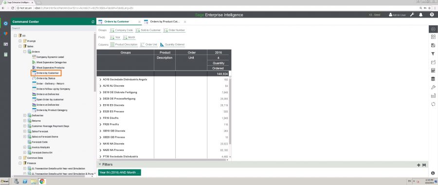
STEP 1: The first report we’ll use is a basic Sales Report by Company Code. This report can be found in the Command Center on the left side of the screen, under X3 > Sales > Orders > Orders by Customer. Double click to run the report, which will open the selection page in a pop up window where you can then apply filters.
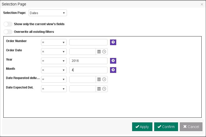
STEP 2: In the newly opened Selection Page pop up, you can select your preferred time frame. For the purposes of this example, we have set the filters for year (2016) & month (4). Click confirm and the report will run to the right of the Command Centre with the filters selected.
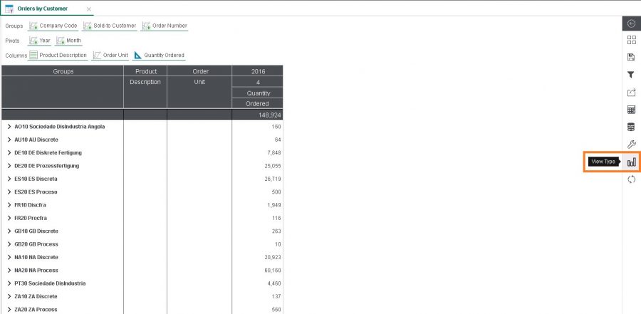
STEP 3: The Sales Report is automatically grouped by company/entity and listed in alphabetical order. By clicking on a company/entity, you can drill down into each one for the Sales Order Number(s). To change the view from a table with tabs to a graphical illustration, click on View Type in the vertical right-hand panel to expand Settings.
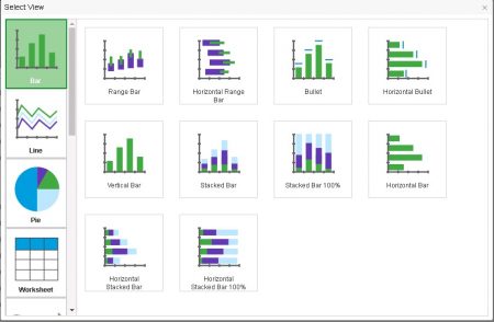
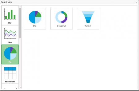
STEP 4: This will expand the menu, showing the options for different View types you can select from. You can scroll vertically through the View categories in the Left side of the pop up, and then chose specific Views within each category. The images below show the “Bar” category and “Pie” category options to give context to the wide variety of built in options available. For our example, we’ll click on the “Pie” chart in the “Pie” category (it may be on our mind with fruit pie season in full swing).
STEP 5: Once we’ve update our View Type, it will automatically close the expanded menus and update the Sales Report. Next, in the same vertical right-hand panel, click on Chart Properties (the wrench icon immediately above View Type) to specify the details for your graph.
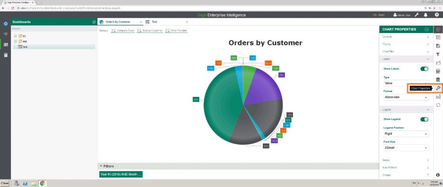
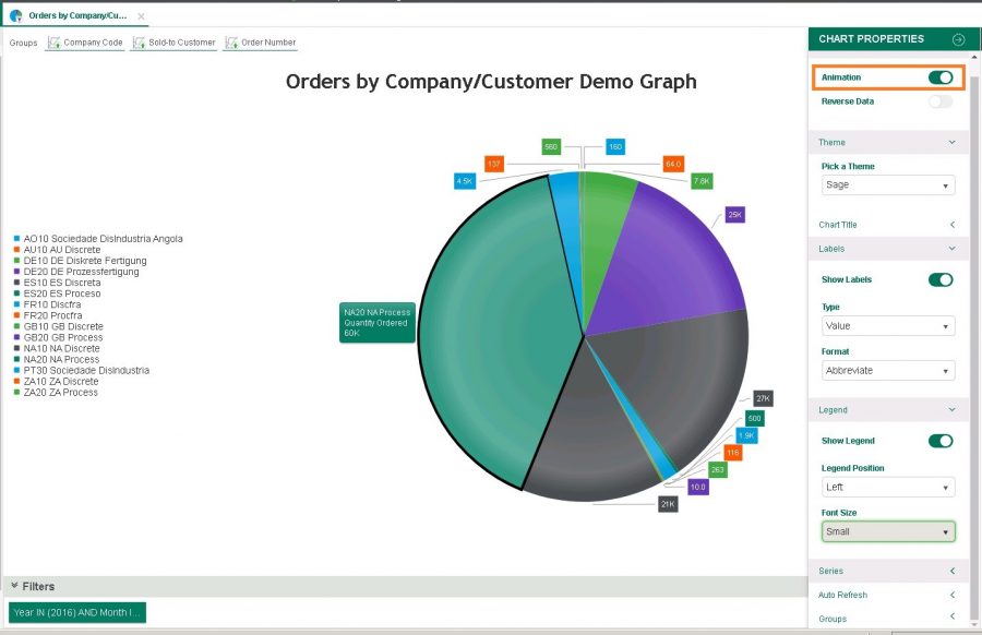
STEP 6: In Chart Properties, you can modify the report title, labels, series, etc. The specific changes made will depend on how you want the information displayed in your dashboard. For reference, pay attention to the chart properties specified in the following screenshot. By enabling Animation (the very top toggle option), we’ve set up this graph so when you hover over a pie slice it will provide further details, which in this case is order quantity.
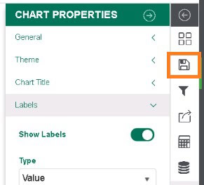
STEP 7: Once you are happy with the layout of the graph, click the floppy disc save icon on the right of the screen and click save as.
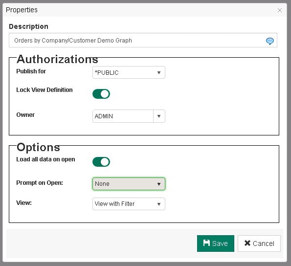
STEP 8: This will open up the save Properties screen shown below. Give your graph report a new name in the Description field. Then choose how you want to publish this report – ‘Public’ so other users with access to the sales orders process can run your new graph report, or ‘Private’ if you want to keep it unique to your log in. You can also edit if you want a prompt box to open when the graph is run so you can update the filters. For our example, we’ve kept the new graph Public but don’t need to edit the filters each time, so have declined the Prompt. Once you hit the Save button at the bottom, it will save the graph by default to the bottom of the list of reports under the Orders process in the Command Centre (where we started this journey). You can always drag and drop this new graph to the top of the orders report list if you want it to appear as the first report though.
How to Create Invoice Detail Sales Report in Sage Enterprise Intelligence
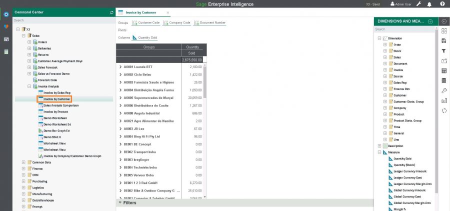
STEP 9: The second report we’ll build is another basic Sales report, but instead this report analyzes invoice details by Customer. This report can be found in the Command Center under X3 > Sales > Invoice Analysis > Invoice by Customer. Same as in Step 1, double click to run the report, which will open to the right of the Command Centre like earlier. By default the groups are Year, Customer Code, and Document Numbers but for the purpose of this example we’ve edited the groupings and columns so we have a similar layout to the orders graph we created, as seen in the following screenshot. To remove groupings or columns, hover over the field you want to remove and hit the X that appears next to it. To add groupings or columns, drag the desired fields from the dimensions and measures list on the right into the groupings and columns toolbar at the top of the screen.
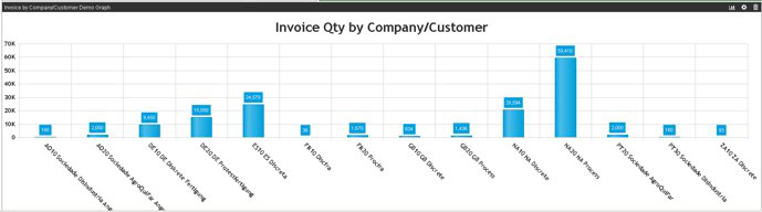
Step 10: To turn this report into a graph repeat the same steps you completed from Step 5 to Step 8. For this example we chose a bar graph so our report will look as follows:
Remember that these are just two examples of reports that can be created in Sage Enterprise Intelligence and used in your dashboard. The reports you choose to include in your dashboard should address your businesses KPIs and unique requirements. If you’re not sure what you reports should include you can explore Corporate Performance Management, which will help you identify your KPIs and design dashboards that will help your business pinpoint areas of improvement, successes and fuel growth.