How to Create Dashboards in Sage Enterprise Intelligence (SEI)
Dashboards can be quite personal and should be created to meet the specific needs of not only each business, but each staff member using the solution – enabling quick, reliable and informed decisions. Often this is left to the IT team when they set up an account, but since what is important can change as roles evolve or with business cycles, easily editable dashboards are key. Sage Enterprise Intelligence (SEI) is one of Sage’s most robust business intelligence solutions, helping businesses expand the functionality of their Sage 300 (formerly known as Accpac) and Sage X3 (formerly known as Sage Enterprise Management) ERP solutions to easily dive even deeper into the analysis & reporting data. Since one of the major features offered in SEI is advanced easily customizable dashboards that give businesses access to summarized reports, with real-time information, we’ve laid out a step-by-step guide so any SEI user can edit & create their own dashboards in the solution.
How to Create Your Dashboard in Sage Enterprise Intelligence
Before you can create a dashboard you need to have reports created that can be added to your dashboard, so please refer to our blog on How to Create Reports for Dashboards in Sage Enterprise Intelligence to learn how.
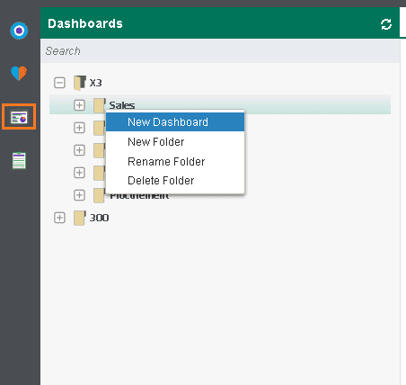
STEP 1: To begin the process of creating the Dashboard, click on the Dashboard icon on the left of the screen, which will open the dashboard menu (shown expanded below). Next, right-click anywhere on the dashboard menu and click New Dashboard. If you right click a specific folder it will save the dashboard into that folder, but if you don’t click on a specific folder, it will save it in the dashboard menu.
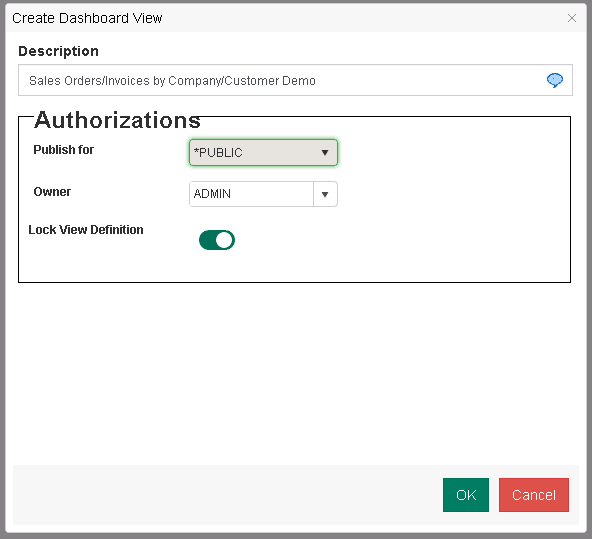
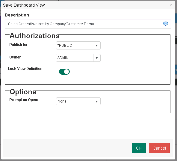
STEP 2: Clicking New Dashboard will open a new pop up window (as seen in the example below), which will prompt you to define some key information about your dashboard. Name your new dashboard in the Description area and define how you would like it published from the drop down menu (public or private). In this example, we’ve chosen to name our new dashboard “Sales Orders/Invoices by Company/Customer Demo”. Also, if you want to prevent other users from making changes to your report, select Lock View Definition. Once complete, click Ok.
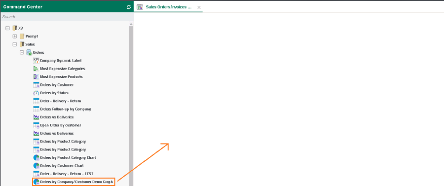
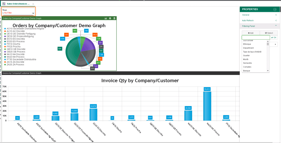
STEP 3: After naming and creating your new dashboard , it will appear as a tab, with the name at the top of the screen and showing a blank screen on the right-hand side of the Command Center. To add items to your empty Dashboard, click on the desired reports from your list on the left and drag them into the space on the right. In this example, we’re going to begin populating this dashboard with the two graphs we created in our How to Create Reports for Dashboards in SEIblog (Orders by Company/Customer & Invoice Quantity by Company/Customer) by simply clicking and dragging them onto the blank dashboard.
STEP 4: Once you have added your graphs onto the dashboard, you can resize and move them to accommodate your layout needs. To change the size, hover over the edge of the graph until your mouse changes into arrows, then click on any corner and expand or retract. To move a graph, simply click anywhere within the graph, then drag and drop. If you need to create more space, you can click the right side of the Command Centre window and drag to the left to shrink the Command Centre and expand your dashboard window. To remove a graph, click the garbage can icon on the top right-hand corner of the graph. In this example, you’ll notice that we have left some blank space in the top right of our dashboard where we’ll add dynamic filter buttons.
Note: For reference in the next step, please note in the image below, on the right hand of the screen there is a vertical menu with a circular Settings icon at the top, a floppy disk icon below, and a wrench icon (which is the Dashboard Properties) two icons below that.
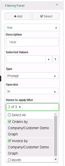
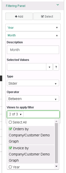
STEP 5a: Once you’ve setup the layout of your dashboard it’s helpful to set up filters, such as date, that can be used to drill down and sort the data you’ve included. This is optional but recommended for ease of use. In order to do this the reports you’ve included need to contain similar filters and groupings, which we explain how to do in the blog How to Create Reports for Dashboards in SEI . On the right hand of the screen, click on the Settings icon we mentioned above to expand the vertical menu, and then click on the wrench icon (Dashboard Properties), which is shown expanded below. Once open, click < to expand the Filtering Panel options, and click on +Add. You can either scroll down the menu or start typing to search for the fields you wish to filter on. In our example, we filtered for year/month and grouped on the same fields in both of the graph reports. Once you have selected all the fields you would like to use, click Ok.
STEP 5b: After clicking Ok, the filtered fields will appear on the filtering panel immediately below the Search field. You can then click the down arrow on each filter field to expand its view and update details. As shown in the screen shots below, in this drop down menu, you can edit the description/name, select values (for example, if we set between 4 and 5 as the selected value for filter Month, only data for April and May of each year will be selected), update the filter type and specify what views you want to link the filter to. For this example we’ve added a prompt year filter and a month slider filter. The ‘Operator’ field refers to the filter criteria, allowing you to choose form options such as in, not in, greater than, less than etc. Overall, these filter options give you the ability to narrow down and quickly navigate the data in your reports.
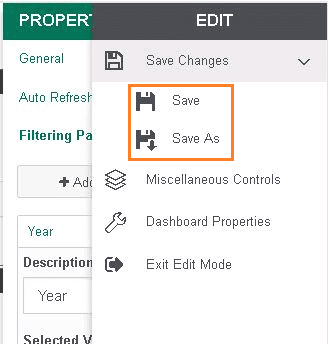
STEP 5c: Once finished, click on the menu on the right-hand side and click Save Changes. You can choose to either Save or Save As.
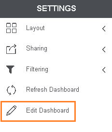
STEP 6a: After finishing with the filtering panel, we are going to add another button to our Dashboard – a dockable filter control. From the right-hand menu, click Edit Dashboard under Settings.
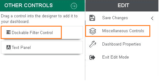
Next, click the Miscellaneous Controls icon, click and hold Dockable Filter Control and drag it onto your dashboard.
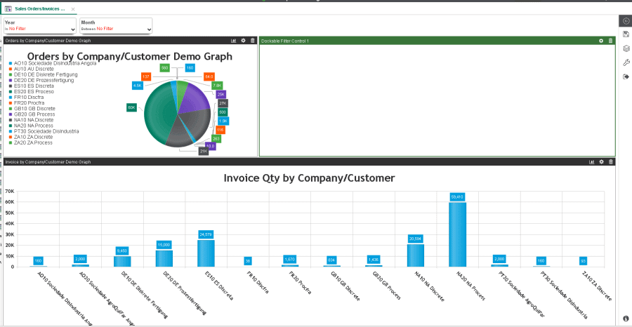
Once you’ve added the Dockable Filter Control your dashboard should look something like this:
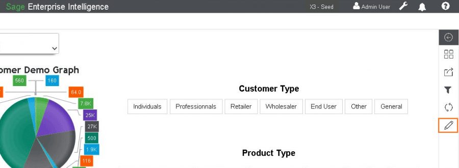
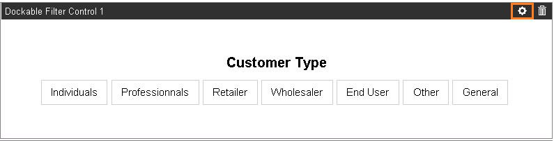
STEP 6b: Click on the gear cog icon at the top right (highlighted below) of the Dockable Filter Control to access the Properties window, shown expanded in the image below with “Customer Type” used for this example. From here you can define the layout and field you want to filter on.
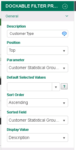
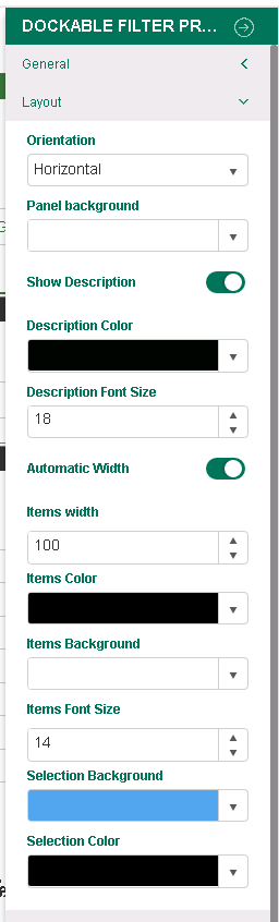
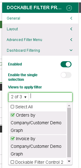
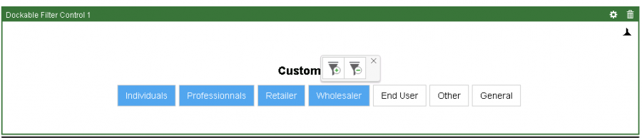
STEP 6c: The first button we will define is the customer type (customer stat group 1). Please see screenshots to review General, Layout and Dashboard Filtering settings. The “Parameter” drop down under the General tab is where you specify what field you will be filtering. The “Views to apply filter” area on the Dashboard Filtering tab is where you link the filter to the specific views you have on your dashboard.
STEP 6d: We repeated Step 6a, 6b and 6c for the Product Stat Group 1 (Product Type) to add another Dockable Filter below the Customer Type filter, as seen in the following screenshot:
STEP 7a:Once all of your filters are set up it’s a good idea to test your filters to ensure they are working correctly. Test your Dockable Customer Type & Product Type Filters by clicking the dimensions you want to filter and clicking the + to add or – to exclude the filter. Depending on what graphs you linked the filters to in Step 5b, they will update the corresponding graph to only include the dimensions you specified. If you linked both filters to both graphs, then they should update together!
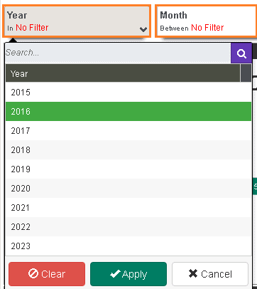
STEP 7b: Next, go to your date filtering panel on the top left of your dashboard and test it by clicking on the year and month drop downs at the top of the dashboard and applying some filters (shown up close in the cropped image below). By applying this filter your graphs should only include data from the years and/or months you selected.
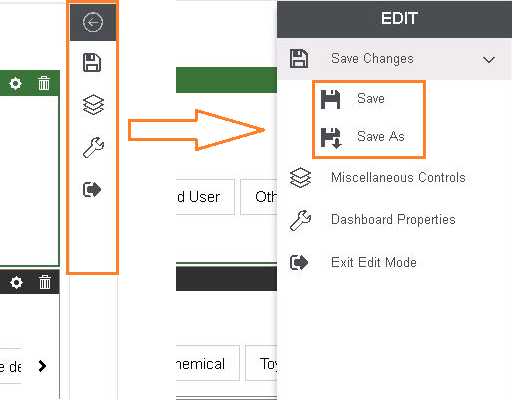
STEP 8a: Once you are happy with the layout and filter settings of your Dashboard, on the right vertical toolbar, click the floppy disk icon to see the Save options. Click the Save button to overwrite your version or Save As to create a new version. Once saved, you can click Exit Edit Mode to close out of the design view.
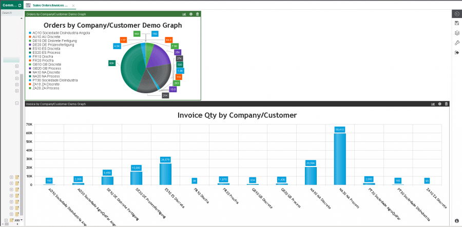
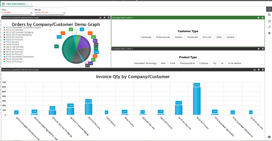
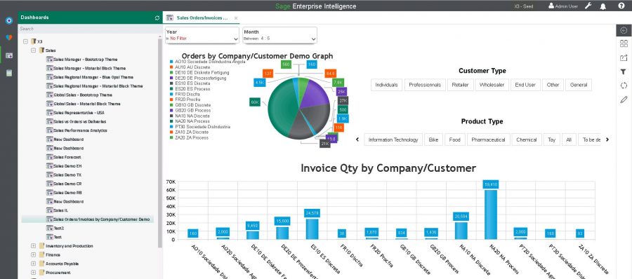
STEP 8b: Your dashboard should be visible in the folder you created it in Step 3a. To run and view the finished product, navigate back to where you saved it in the Dashboard tab and double click your dashboard. The finished product of the dashboard we built looks like this:
The most time you’ll ever have to put into a dashboard is the initial set-up. Following that, it creates a snapshot of key information that you need for your business, summarizing it so you can maximize the information you’re getting while minimizing the work it takes to get it . The value of these dashboards are amplified when they can be accessed directly within your Enterprise Resource Planning (ERP) solution. If you’d like to learn how to embed SEI dashboards into Sage X3 follow our step-by-step guide.